Law Institution Website
“Cultivating Leadership. Advancing Knowledge. Creating Enduring Value.”
Amarta Artha Institute is a strategic leadership and research institute based in Yogyakarta, Indonesia. I was commissioned to build their complete institutional web presence from the ground up — spanning branding, information architecture, and frontend implementation.
The client had no existing digital presence and no design brief. As the sole point of contact, I held discovery and review meetings to align on content, structure, and design direction — translating non-technical requirements into a fully working web product through iterative revision cycles.
Pages & Features
Landing Page
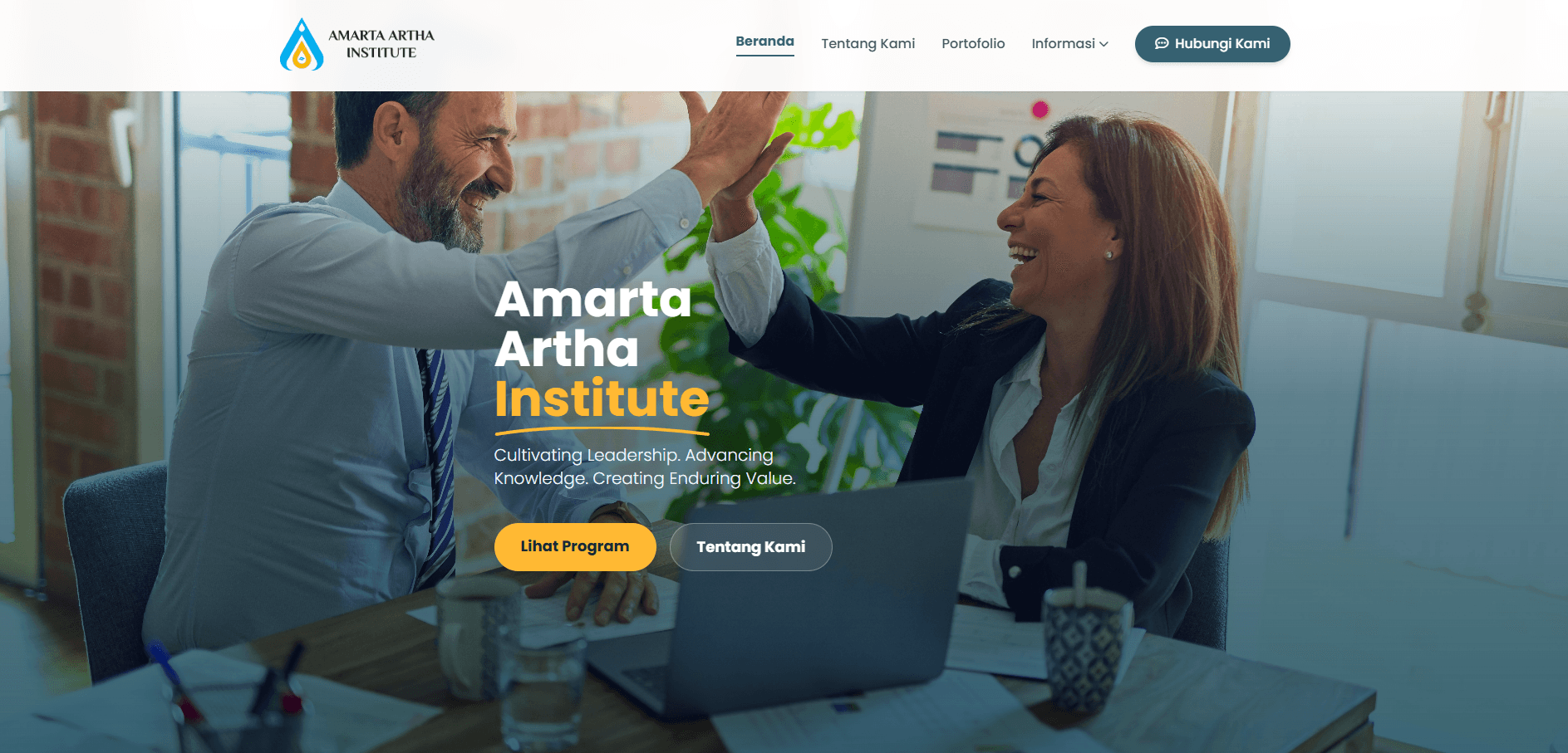
Hero section with a full-screen background image, institute tagline, and dual CTA buttons. Includes a profile section, program highlight cards (Strategic Capacity Building + Konsultasi Umum), and a Google Maps contact section.
About Page
Full company story, philosophy (Amarta + Artha meaning), vision & mission, 4 strategic pillars, leadership team profiles, and a 2030 vision section.
Services Page
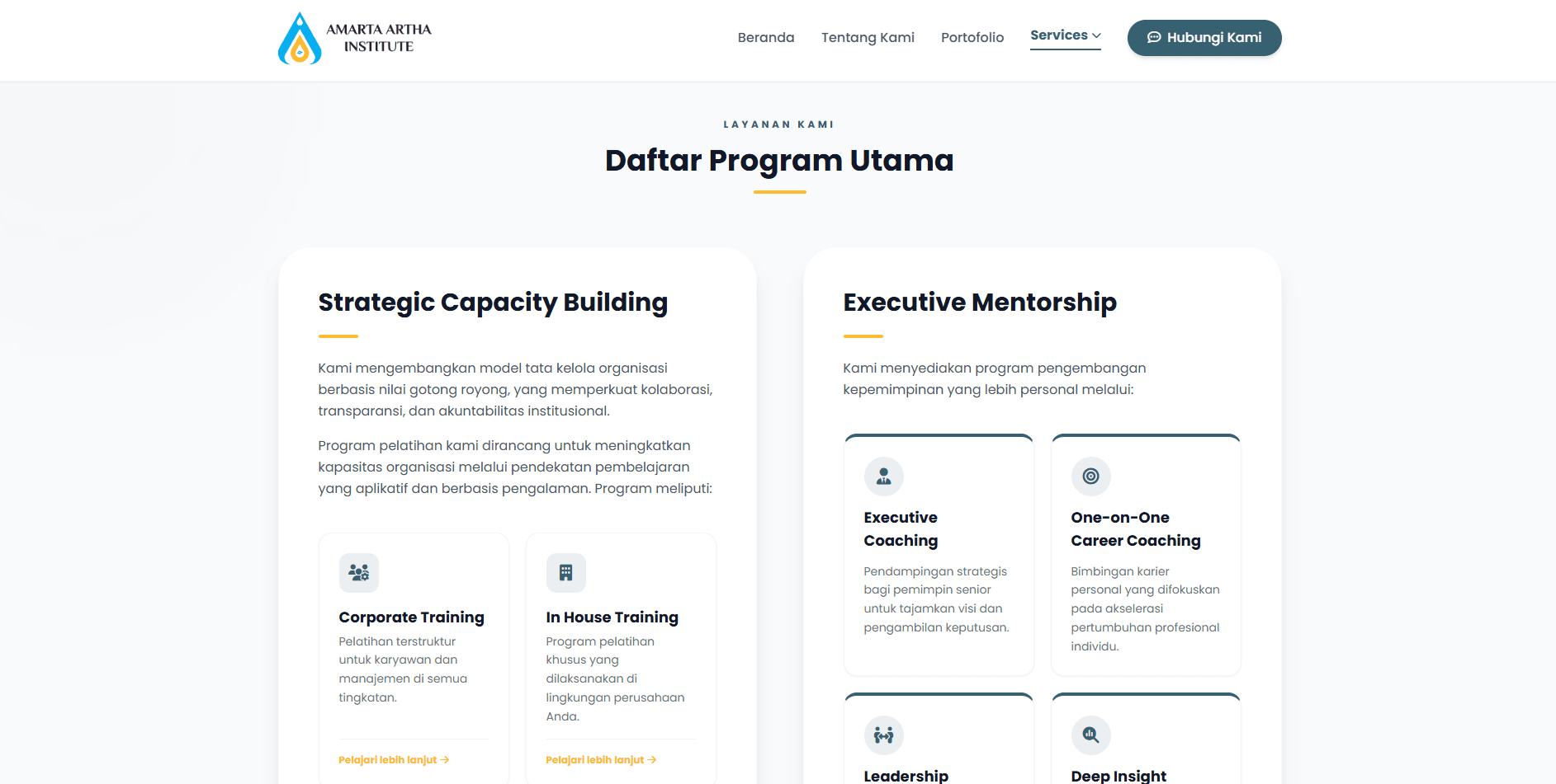
Two-column layout separating Strategic Capacity Building and Executive Mentorship. Both use a custom card component with hover effects, a dark research summary card, and WhatsApp CTAs.
Portfolio Page
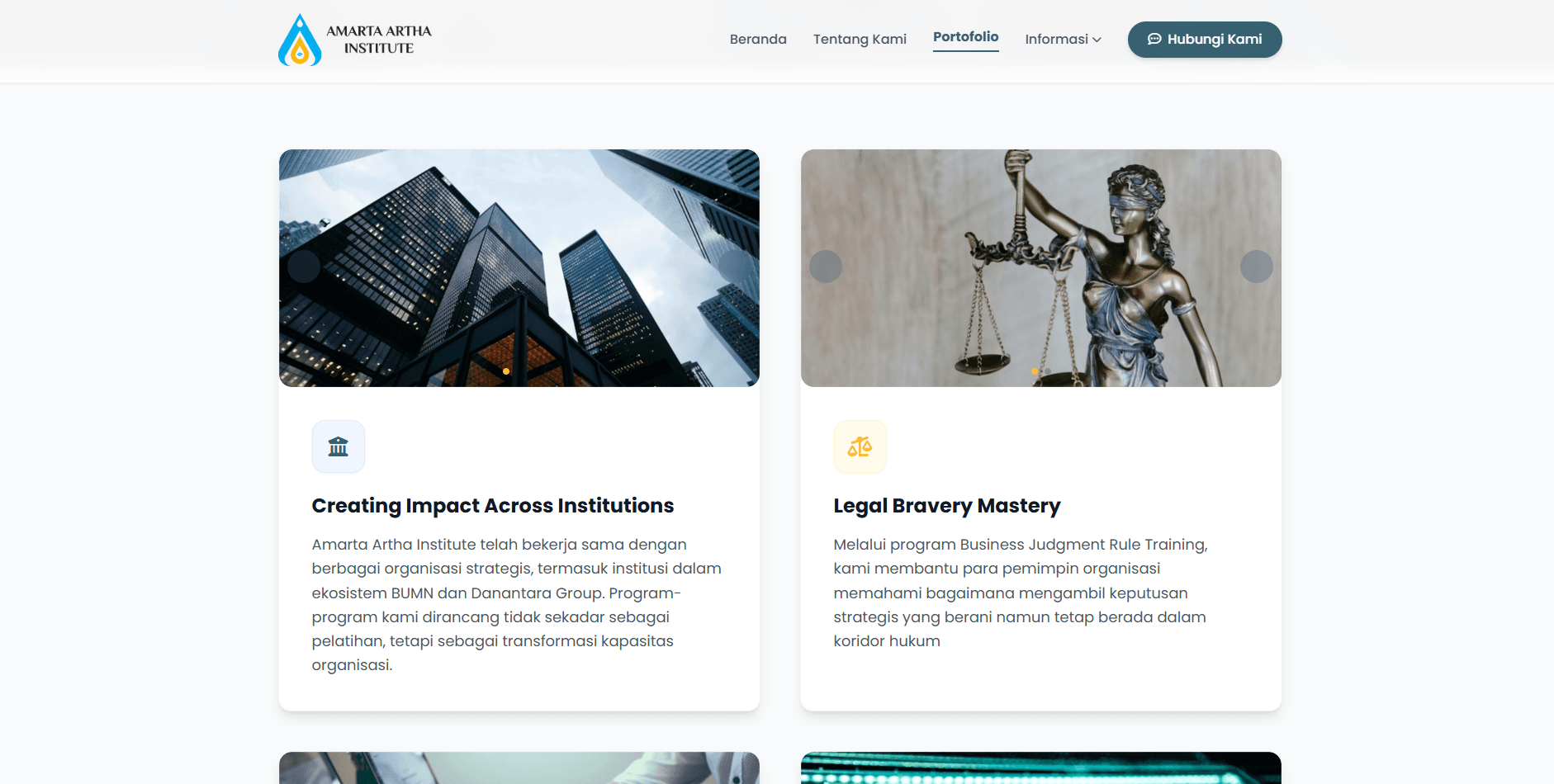
Showcases the institute's client work and organizational impact in a structured, visually engaging layout.
Tech & Architecture
Frontend
HTML5 & Tailwind CSS
Semantic markup with a utility-first CSS framework for rapid, consistent styling across all 4 pages.
JavaScript
Handles interactive elements: mobile nav toggles, scroll effects, and micro-animations without any framework overhead.
Design System
Custom Color Tokens
Primary (#376171) and secondary (#FFB933) color tokens applied site-wide for brand consistency.
Image-Top Card System
Cards feature a hero photo, icon badge, title, and description for visual storytelling, inspired by modern SaaS product pages.
Integrations
Google Maps Embed
Embedded interactive map for the institute's physical location in the contact section.
WhatsApp API & Google Forms
Conversion-focused CTAs drive direct user action for program inquiries.
Design Highlights
Image-top card system — cards feature a hero photo, icon badge, title, and description for visual storytelling
Micro-animations — hover lift, scale-on-hover images, icon transitions throughout
Mobile-first responsive — grid collapses gracefully across all breakpoints
Conversion-focused CTAs — WhatsApp API, Google Forms, and anchor links drive user action
Consistent design system — primary and secondary color tokens applied site-wide
Challenges & Solutions
Client had no design brief
Ran structured discovery sessions to extract visual preferences and content goals before writing a single line of code
Services page felt cluttered
Restructured into two distinct columns with a shared outer container for visual breathing room
Cards lacked visual hook
Introduced image-top card design inspired by modern SaaS product pages for stronger visual storytelling
“The greatest challenge was acting as both developer and project manager without a design brief. By running structured discovery sessions and iterating rapidly through revision cycles, I delivered a complete, polished, multi-page institutional website entirely from scratch from zero assets to final sign-off.”